Monday, 10 January 2011

Question 3

Music Video Pitch Feedback
Previously on my blog I have gone into detail on the target audience feedback I received from my music video pitch. Here is the link to that post:

Music Video Feedback
For our target audience feedback for our music video, we decided to take advantage of the online revolution ourselves by posting our questionnaire on the popular social networking site facebook.com along with our music video. As most of the friends we have on facebook are of our target audience of teens and young adults, we thought this would be a good way to get a range of feedback from our target audience. Here is the link to the survey we created using surveymonkey.com: http://www.surveymonkey.com/s/FT7HKML

We also used the same questionnaire when we showcased our music video to members of our target audience at school, so we received a lot of feedback.

1. Positive feedback
When asked, many members of our target audience said they liked or enjoyed our music video, saying they liked our integration of lyrics in the video, use of image motifs and the happy concept. One said they liked the fact the audience could relate to the concept, which we were very happy with as this was the reaction we'd intended for the audience. Another said "a very well put together amateur music video demonstrating a strong sense of storytelling backed up with well placed performance pieces", we were thrilled with this comment as it shows the audience understood the indie genre we conveyed within our music video and also the narrative concept.
2. Negative feedback
Members of the audience commented on the lack of lighting and how some shots were dark and hard to see. We also recognised this problem and agree with this statement, as the natural light we were using got darker it was harder to tell on the camera if the lighting was that dramatically different. When it came to editing we noticed the problem, but unfortunately we were unable to re-film these particular scenes, so we edited the scene using the colouristaion tool to try and make the scene brighter.
3. What was expected/unexpected?
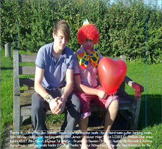
Unexpected were some comments made towards the clown in our video. We used the image motif of a clown to relate to the fun nature of our artist and also as a visual representative of the main character's feelings. However, a member of our audience stated in the questionnaire that they confised by the inclusion if the clown and they weren't sure of his purpose in the video. We feel if we'd shown our target audience our ancillary tasks, they'd see the benefit of the clown in the creation of a brand identitiy and as an image motif.
4. What would you do differently?
If we were to do this music video again, from the comments made by our target audience i would ensure the lighting was correct in every shot as editing them to look brighter only made them look grainy. Another person suggested weaving our narrative and performance concepts together, so at the end of the music video the guy would take the girl to a gig of the artist, therefore linking the two. This was a good idea and would've linked our music video with our artist further than we already have and also making it more pleasing for the audience.


Question 2

How effective is the combination of your main product and ancillary tasks?


Question 1

In what ways does your media product develop or challenge forms and conventions of real media products?

Saturday, 8 January 2011

Final Website

Here is a link to our final, finished website:

http://www.twodoorcinemaclub.angelcities.com/

Wednesday, 5 January 2011

Wednesday, 15 December 2010

Website Draft

For our website design we had problems creating a live website with the original program we chose. We decided then to create a website with Serif PagePlus 11, as it would be an easier option. This meant we had to redesign our plan for the website,as our original idea couldn't be achieved on serif. We took the main image we aimed to use on the front cover of the digi-pack and put it on the home page to achieve a consistent brand identity. We also used the house colours of blue, red and white on the homepage for a similar effect.
This is the draft of the homepage for our website. At this draft stage we have difficulty making the website live with the images still visible, so when we complete the website i will post a link on my blog to the live site. At this stage there are a few conventions we would like to meet typical of an artist's website, such as a YouTube video of the music video we created on the homepage as we saw this featured on many other websites. Other websites i've analysed also include a wider layout, whereas ours is more vertical so i'd adapt our website to fit this convention.

Monday, 6 December 2010

Website Planning - Typography


To give our artists a brand identity we will have to keep a certain style with them and show the band displayed in a certain way one of the ways we can do this is by the typography , the font, logo and house color. Here our some samples for logo : They are all in black at the moment but we will incorporate the house colours of red blue and white when we chose a logo.


For the website font we have analysed other website designs and decided the font needs to be basic but inkeeping with the artists brand identity we are creating. We may use a maximum of 2 of these fonts so not to confuse the audience and make it look messy, here are a few fonts we like and will ask our target audience to decide their favourites; these will be the ones we use.


Website Planning - Design

As we have chosen to create a website displaying our artist we wanted to use a programme that will help us produce a website that appeals to our target audience and also fits in with the genre of our artist. Using the website Bandzoogle.com, we created a template of the homepage of our website. As you can see from the image here we took a screen grab from our music video and embedded it on the tshirt of the girl on the homepage. This relates our music video to the website therefore tieing together the different aspects of our artists material. The house colours we are using are blue, cherry red and white which feature heavily throughout our music video and will also be seen on or digipack. We will also use these colours for our font and in the header on the website to keep the aspects of the video and website consistent.

Website Flat Plan

Monday, 15 November 2010

Genre Research

I have chosen two bands that are of a similar genre to our artist, "Two Door Cinema Club" which is of the indie genre of music. I will analyse theses artists websites and promotional material and compare them to the ideas we have for our band and how we can incorporate typical features of that genre into our material.

The first artist that has a similar genre and style as our artist is Vampire Weekend, an indie rock band from New York City signed to XL Recordings. Their latest album "Contra" is shown here:
As you can see the house colours are muted, light colours such as pale yellow, violet and white. The mixture of pale colours suggest a wealthy, vintage theme especially with the young woman wearing Ralph Lauren polo shirt that doesn't appear to be new. The large, straught edged font contrasts to the vintage look to make it stand out against the muted background. The woman fills nearly all of the space on the cover, with her eyes staring directly at the audience engaging them with the cover. However, she is set back from the text showing her lack of importance against the artists name and album name.


This is Vampire Weekend's website. They've clearly displayed the woman on their album cover again on their website, to tie the two together and establish the brand identity. They've focused on the eyes to draw the audience in again but placing the text over her face so people concentrate on what's being said. They've used hyperlinks on "click to buy", "listen" and "lyrics" to allow people to fully engage with the new album and give them as many opportunities as possible to view it before buying it, therefore gaining repect from their audience. The house colours are shown again here to provide consistency across their products, and as the image is zoomed in we can see the grainy effect of the picture, reinforcing the vintage theme.

Friendly Fires also has a similar genre and style to our artist, they are an indie-dance band and also signed to XL Recordings. Their latest, self titled album is shown below:
This album cover is very different to that of Vampire Weekend's. The house colours are considerably darker; black and dark green, however white is also incorporated here to act as a contrast to the dark colours. The typography is simple and delicate, an opposition to the striking image below it. The broken shards of the mirror seem to be reflected a natural scene, blurred through editing, with what looks like a snake behind it. I believe the idea behind this album is to allow the audience to decipher it how they wish as it's a confusing and subjective image. Maybe this is a reflection of their music?


The artists website links well with their album cover, establishing their brand identity. The same delicate font used for the logo is used again here, and the same shards of glass and splattered paint are used to relate the two together further. The dark, earthy house colours are also shown again in their website, establishing a connection between the website and album cover, one that the audience would remember and recognise as theirs.

Through the analysis of other artists of a similar style and genre to mine, i can see that similarities between both my ancillary tasks is pivotal for establishing a brand identity for the artist and also the audience im aiming my product at.

Monday, 8 November 2010

What Makes an Effective Album Cover?

An effective album cover reflects the the genre and individual brand identity of an artist. For example the White Stripes album "The Hardest Button to Button":

The layout for the White Stripes album is very simple; the black and white layout makes the red typeface stand out and therefore highlighting it's importance. The contast of black and white also draws your attention to the centre of the album cover where most of the detail is focussed.
This cover holds a clear connection between the music video and promotional material, house colours are seen across all their products for example. The button created in the O's in "Button" could be an image motif as it also appears in their music video.
The album cover also represents the the rock genre of the artist, through the uneven lines, sharp edges, and harsh, in-your-face style colours.

The designer has therefore made this album cover effective through:
  • The clear relationship between the video and album artwork - through colours, images and themes.
  • The choice of image, font and colour.
  • Making it interesting/desirable overall.
  • Developing the artists star image and brand identity.
  • Reinforcing the genre of the brand.

What is a digipack and how we aim to use it

A digipack is the same as an album/cd cover but with all the dimensions and folds, to make it into the cd packaging. The most common dimensions of a cd cover design are 57cm x 14.5cm . 57cm is for 4 panels of 14cm each and a spine. The digi pack can flip open like a book can have three parts so that one side opens to the left and one side opens to the right .The digipack must have an envelope or casing- usually a plastic press to store the dvd/cd , this is usually encased in front of a piece or paper. We want to do ours as a three fold , here is a template i found on the internet.


Sunday, 17 October 2010

Filming Diary

First Day of Filming, Sunday 10th October
I will display the pictures and comments of our process of our first day of filming on fickr.
http://www.flickr.com/photos/55668688@N06/

Monday 25th October
In our original storyboards (shots 22-25) we would fulfill our "guy gets the girl" concept with a twist by him winning her over with a space hopper, however this particular prop was not accessible to us so we had to think of an alternative to complete our concept.
We came up with the idea of using candles spelling out some of the lyrics as this would continue our theme of lyrics being incorporated into the music video. However we didn't have enough candles to spell words so we settled on a question mark which provokes the audience to engage more with what he could be asking, in turn thinking about the lyrics without actually reading them.
The idea we had was the guy would ring the doorbell at night and the girl would look open the door to find him waiting with a question mark displayed on the floor. We liked the idea of the light of the candles standing out against the darkness. However when we came to film this, it was raining outside and we couldn't think how we could compromise by making the scene inside, as it wouldn't make sense. We decided to re-film this scene another day when it was dryer outside, therefore leaving us with a more successful image.

Thursday 28th October
Today was alot more successful in terms of the weather and the overall mise-en-scene. The rain had subsided and we were able to get more effective light positioning. We decided these shots fit in well with our concept and will therefore replace shots 22-24, which will change on our final storyboard.

Last day of filming, Sunday 31st October
Today we managed to get all of our performance shots filmed for our music video. These shots will appear as an introduction to the music video and willl also be cut to back and forth in the chorus and between scenes.

Shooting Schedule

Sunday 10th October - Majority of filming completed
  • 12pm-3pm - all scenes of girl rejecting guy
  • 3pm-6pm - all scenes of happiness between girl and guy
  • 6pm - 7pm - general shots, eg lyrics written on posters, shots of clown etc
  • 7pm - sunset shot
Sunday 25th October - Performance shots and other night-time scenes
  • 8pm-9pm - performance shots
  • 9pm-10pm - "guy gets the girl" shots

Final Storyboards

Wednesday, 6 October 2010

Audience Feedback from Film Pitches

Click on the images to enlarge.

Positive feedback from our audience:

Wordle: amyedmondsmediafeedback

Even better if...

Wordle: amyedmondsmediafeedback2

These words clouds were created using wordle.com

We recieved a huge amount of positive feedback from our target audience, which made us confident our ideas would be well recieved by other members of our target audience and would fit well with our chosen artists music. However, the ideas on how we could improve our production from our target audience were also very helpful, for example many mentioned colouristaion to help reflect the mood of the characters in our music video. One person suggested over exposing the final shots to emphasize that sunny, happy feeling. Another suggested a more diverse range of camera shots, and upon examining our draft storyboards we've seen that more diversity in this area would greatly benefit our music video.

Music Video Pitch

In this video me and my friend are pitching our ideas for our music video to our teacher and other students in our class. After the pitch we recieved feedback from everyone that i will upload onto my blog, where they comment on what they liked and what they thought could be improved.

Lyrics Annotated With Ideas

Two Door Cinema Club – Something Good Can Work

  • Our interpretation of the song is that it's being sung in a motivational way towards a girl as she wants to make something of herself
  • We are going to create a twist on this interpretation so a guy is trying to to motivate the girl to make something of herself with him.

Our ideas that match the lyrica are written in bold.


Mostly narrative idea, some performance shots incorporated to enhance visual excitement for the viewer.
There's a spanner in the works you know,
you gotta step up your game to make to the top.
So go!
Gotta little competition now, - idea: 2 guys in 2 different cars (one better) main girl gets in other guys car (not main character) medium shot from back of the car ans girl gets in the better car and main guy behind reverses away
you're going to find it hard to cope with living on your own now.
Uh oh! – Split screen – one of girl and one of guy – fades into chorus
Uh oh!

Let's make this happen, girl you gonna show the world that something good can work and it can work for you. – General idea of the guy trying to make the girl happy
And you know that it will.
Let's get this started girl, we're moving up we're moving up It's been a lot to change but you will always get what you want.
Took a little time to make it a little better,
it's only going out, just one thing and another,
you know! – Webcam shots of guy singing lyrics to girl, split screen of rejection?
You know!

Took a little time to make it a little better, it's only going out, just one thing and another,
you know!
You know!

Let's make this happen, girl you gonna show the world that something good can work and it can work for you. – Rapid costume change, pace of cuts follow music
And you know that it will.
Let's get this started girl, we're moving up we're moving up but It's been a lot to change but you will always get what you want.

Instrumental – guy gets cake in face, stop frame animation of his reaction shot happening.

Let's make this happen, girl you gonna show the world that something good can work and it can work for you.
And you know that it will. – Close-up of guy’s face winking
Let's get this started girl, we're moving up we're moving up but It's been a lot to change but you will always get what you want.

Let's make this happen, girl you gonna show the world that something good can work and it can work for you.
And you know that it will.
High angle shot of couple hugging with stop motion heart being drawn around them
Let's get this started girl, we're moving up we're moving up but It’s been a lot to change but you will always get what you want

Monday, 27 September 2010

Location Ideas

These are a few pictures we took as locations for some of our shots. We chose the general location of our local village in particular as it's easily accessible to us and fits in well with our production idea. When taking these pictures we had trouble with lighting and the overall mise-en-scene as it was raining and the ground was wet, but we plan to film on a brighter, more cheerful day to reflect our idea for the music video. The link directs you to a photostream on flickr with comments i made of the location selections.

http://www.flickr.com/photos/57920293@N02/?saved=1

First Draft of Storyboards