Monday, 10 January 2011

Question 3

Music Video Pitch Feedback
Previously on my blog I have gone into detail on the target audience feedback I received from my music video pitch. Here is the link to that post:

Music Video Feedback
For our target audience feedback for our music video, we decided to take advantage of the online revolution ourselves by posting our questionnaire on the popular social networking site facebook.com along with our music video. As most of the friends we have on facebook are of our target audience of teens and young adults, we thought this would be a good way to get a range of feedback from our target audience. Here is the link to the survey we created using surveymonkey.com: http://www.surveymonkey.com/s/FT7HKML

We also used the same questionnaire when we showcased our music video to members of our target audience at school, so we received a lot of feedback.

1. Positive feedback
When asked, many members of our target audience said they liked or enjoyed our music video, saying they liked our integration of lyrics in the video, use of image motifs and the happy concept. One said they liked the fact the audience could relate to the concept, which we were very happy with as this was the reaction we'd intended for the audience. Another said "a very well put together amateur music video demonstrating a strong sense of storytelling backed up with well placed performance pieces", we were thrilled with this comment as it shows the audience understood the indie genre we conveyed within our music video and also the narrative concept.
2. Negative feedback
Members of the audience commented on the lack of lighting and how some shots were dark and hard to see. We also recognised this problem and agree with this statement, as the natural light we were using got darker it was harder to tell on the camera if the lighting was that dramatically different. When it came to editing we noticed the problem, but unfortunately we were unable to re-film these particular scenes, so we edited the scene using the colouristaion tool to try and make the scene brighter.
3. What was expected/unexpected?
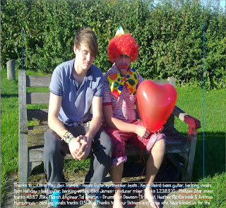
Unexpected were some comments made towards the clown in our video. We used the image motif of a clown to relate to the fun nature of our artist and also as a visual representative of the main character's feelings. However, a member of our audience stated in the questionnaire that they confised by the inclusion if the clown and they weren't sure of his purpose in the video. We feel if we'd shown our target audience our ancillary tasks, they'd see the benefit of the clown in the creation of a brand identitiy and as an image motif.
4. What would you do differently?
If we were to do this music video again, from the comments made by our target audience i would ensure the lighting was correct in every shot as editing them to look brighter only made them look grainy. Another person suggested weaving our narrative and performance concepts together, so at the end of the music video the guy would take the girl to a gig of the artist, therefore linking the two. This was a good idea and would've linked our music video with our artist further than we already have and also making it more pleasing for the audience.


Question 2

How effective is the combination of your main product and ancillary tasks?


Question 1

In what ways does your media product develop or challenge forms and conventions of real media products?

Saturday, 8 January 2011

Final Website

Here is a link to our final, finished website:

http://www.twodoorcinemaclub.angelcities.com/

Wednesday, 5 January 2011

Wednesday, 15 December 2010

Website Draft

For our website design we had problems creating a live website with the original program we chose. We decided then to create a website with Serif PagePlus 11, as it would be an easier option. This meant we had to redesign our plan for the website,as our original idea couldn't be achieved on serif. We took the main image we aimed to use on the front cover of the digi-pack and put it on the home page to achieve a consistent brand identity. We also used the house colours of blue, red and white on the homepage for a similar effect.
This is the draft of the homepage for our website. At this draft stage we have difficulty making the website live with the images still visible, so when we complete the website i will post a link on my blog to the live site. At this stage there are a few conventions we would like to meet typical of an artist's website, such as a YouTube video of the music video we created on the homepage as we saw this featured on many other websites. Other websites i've analysed also include a wider layout, whereas ours is more vertical so i'd adapt our website to fit this convention.

Monday, 6 December 2010

Website Planning - Typography


To give our artists a brand identity we will have to keep a certain style with them and show the band displayed in a certain way one of the ways we can do this is by the typography , the font, logo and house color. Here our some samples for logo : They are all in black at the moment but we will incorporate the house colours of red blue and white when we chose a logo.


For the website font we have analysed other website designs and decided the font needs to be basic but inkeeping with the artists brand identity we are creating. We may use a maximum of 2 of these fonts so not to confuse the audience and make it look messy, here are a few fonts we like and will ask our target audience to decide their favourites; these will be the ones we use.